UI update
Passes new content to the UI and refreshes it.
Identifier: ui_update
Elements
- widget_params: References the UI elements that have to be changed instead of using pre-defined parameters.
- Required: Yes
- Default value: Empty
Content of widget_params
- widget_params is a list of ui_element.
- ui_element: Contains the parameters, which should be changed.
- name: Attribute of ui_element, which is the reference to the UI element to update.
Example
<ui_update id="show_specified_amount">
   <widget_params>
      <ui_element name="EXT_SCANNER_NAME">
         <param name="content">Socket 7Xi</param>
      </ui_element>
      <ui_element name="STATUS">
         <param name="content">CONNECTED</param>
         <param name="text_color">green.dark</param>
      </ui_element>
   </widget_params>
</ui_update>
Change Button Status
Changes a button status. It is used to activate or deactivate a button.
Identifier: change_button_status
Elements
- button_tag: The name of the button in your layout. This "name" must be uppercase.
- Required: Yes
- Default value: Empty
- control: Sets the status to either "ACTIVATE" or "DEACTIVATE"
Example
<change_button_status id="deactivate_continue_btn">
    <button_tag>CONTINUE_BTN</button_tag>
    <control>DEACTIVATE</control>
</change_button_status>
Notification
Displays a temporary notification at the side of the application. It does not influence the workflow.
Identifier: ui_notification
Attributes
- type: Defines the visualization of the notification. Possible values: INFO, NOTIFICATION, WARN, and ERROR.
- Required: No
- Default value: INFO
- duration: The time after which the notification disappears. Possible values: SHORT (3 seconds), and LONG (10 seconds).
- Required: No
- Default value: SHORT
- show_immediately: Displays the notification immediately.
- Required: No
- Default value: False
Elements
- message: The content to be shown
- Required: No
- Default Value: Empty string
Example
<ui_notification id="error_note" type="ERROR" duration="LONG" show_immediately="true">
   <message>No server connection established!</message>
</ui_notification>
Dialog
Displays a dialogue window that requires interaction with the user. It sends events such as which buttons the user clicked for a particular calling step.
Identifier: ui_dialog
Attributes
- type: Defines the visualization of the dialog. Possible values: INFO, INTERMEDIATEPROGRESS, PROGRESS, QUESTION, NOTIFICATION, WARN, ERROR, and FATAL.
- Required: No
- Default value: INFO
- title: A short name for the dialog.
- Required: No
- Default value: Empty string
- message: The content to be shown.
- Required: No
- Default value: Empty string
- close_command: The dialog will close, whenever the input event is triggered.
- Required: No
- Default value: None
Elements
- buttons: Contains a list of buttons the user can click. It is possible to define up to three buttons. The minimum is one button.
- Required: Yes
- Default value: Empty
Buttons
- text: Label text of the button.
- Required: Yes
- Default value: Empty
- command: The event command that is triggered once the button is pressed.
- Required: Yes
- Default value: Empty
- speech_command: The speech command that activates this button.
- Required: No
- Default value: Empty
- focused: Sets one button to be pre-selected.
- Required: No
- Default value: False
- sound: See PlaySound Action for available sounds.
- Required: No
- Default value: Empty
Output
Triggers events that contain the command specified within a button once it is clicked (or its speech command recognized).
Example
<ui_dialog id="test" type="INFO" title="my title" message="my message">
    <buttons>
        <button text="New order" command="NEW_ORDER" speech_command="Neue Order" focused="true"/>
        <button text="Same order" command="SAME_ORDER"/>
     </buttons>
</ui_dialog>
Page Dialog
Displays a dialogue screen that requires the interaction of the user. It sends the dialog events that occur once the window is closed.
Identifier: ui_page_dialog
Attributes
- type: Defines the visualization of the notification.
- Possible values: INFO, INTERMEDIATEPROGRESS, PROGRESS, QUESTION, NOTIFICATION, WARN, ERROR, FATAL
- Required: Yes
- Default value: Empty
- title: A short name for the dialog.
- Possible values: Can be a reference to an android resource or be a string.
- Required: No
- Default value: Empty
Elements
- messages: Contains a list of messages that will be displayed in the dialog. Can either reference a context variable or a list of messages. When referencing a context variable, the attribute context_variable is set to the boolean true.
- Required: Yes
- Default value: Empty
- buttons: This contains a list of three buttons the user can click on.
Buttons
There are three buttons the user can click:
- previous_page_btn
- next_page_btn
- close_btn
- speech_command: The speech command that triggers this button.
- Required: No
- Default value: Empty
- focused: Sets one button to be pre-selected.
- Required: No
- Default value: False
- text: The label text of the button.
- Required: Yes
- Default Value: Empty
- command: The event command that is triggered once the button is pressed. This is only available for close_btn.
Output
Triggers events that contain the specified command within a button, once the button is clicked (or its speech command is recognized).
Examples
Minimal
<ui_page_dialog id="show-server-errors-dialog" type="ERROR" title="Procedure failed">
   <messages>
      <message>First Error...</message>
      <message>Second Error...</message>
      <message>Third Error...</message>
   </messages>
   <buttons>
      <previous_page_btn>
         <param name="text">←</param>
         <param name="speech_command">PREVIOUS</param>
      </previous_page_btn>
      <next_page_btn>
         <param name="text">→</param>
         <param name="speech_command">NEXT</param>
         <param name="focused">true</param>
      </next_page_btn>
      <close_btn>
         <param name="text">ANDRRES_cancel</param>
         <param name="command">EXIT_PAGER</param>
         <param name="speech_command">CANCEL</param>
      </close_btn>
   </buttons>
</ui_page_dialog>
All options
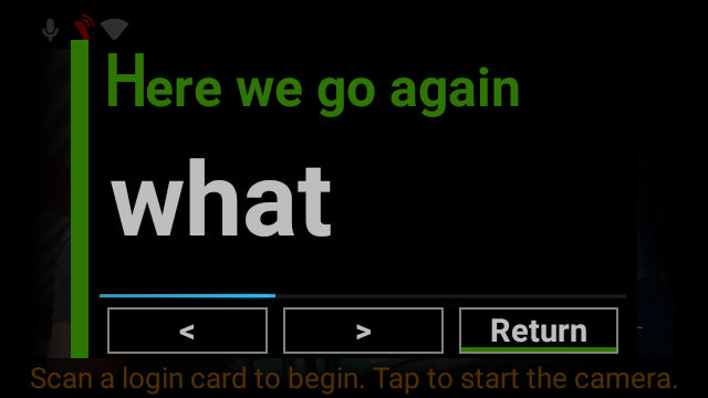
<ui_page_dialog id="confirm_pick" type="INFO" title="Here we go again">
   <messages>
      <message>what</message>
      <message>to</message>
      <message>do</message>
   </messages>
   <buttons>
      <previous_page_btn>
         <text><![CDATA[<]]></text>
         <speech_command>PREVIOUS</speech_command>
         <focused>false</focused>
      </previous_page_btn>
      <next_page_btn>
         <text><![CDATA[>]]></text>
         <speech_command>NEXT</speech_command>
         <focused>true</focused>
      </next_page_btn>
      <close_btn>
         <text>Return</text>
         <command>BW</command>
         <speech_command>RETURN</speech_command>
         <focused>false</focused>
      </close_btn>
   </buttons>
</ui_page_dialog>
Using context_variable = true
<ui_page_dialog id="confirm_what_to_do" type="INFO" title="Here we go again">
   <messages context_variable="true">#{what_to_do}</messages>
   <buttons>
      <previous_page_btn>
         <text><![CDATA[<]]></text>
         <speech_command>PREVIOUS</speech_command>
         <focused>false</focused>
      </previous_page_btn>
      <next_page_btn>
         <text><![CDATA[>]]></text>
         <speech_command>NEXT</speech_command>
         <focused>false</focused>
      </next_page_btn>
      <close_btn>
         <text>ANDRRES_cancel</text>
         <command>BW</command>
         <speech_command>RETURN</speech_command>
         <focused>false</focused>
      </close_btn>
   </buttons>
</ui_page_dialog>
Handling the result
<rule id="confirm_what_to_do_back">
   <expression> <![CDATA[#{event:command} == 'BW' || #{event:command} == 'RETURN']]> </expression>
   <actions>
      <action ref="backwards"></action>
   </actions>
</rule>
Progress Notification
Opens and closes an intermediate and non-interruptive notification at the top right corner of the screen. This lets the worker know if something is happening in the background.
Suggested use-cases:
- A worker has to wait until communication is executed.
- Waiting for Synchronous Network-Communication (downloading or uploading files or confirming data to BackEnd).
Identifier: ui_progress_notification
Attributes
- id: Reference to displayed notification, needed to handle the "close" action.
- Possible values: underscore_separated_string
- Required: Yes
- Default value: Required to be set, no default value.
- title: Text displayed in the TitleBar
- Possible values: Optional title (wf variables will be resolved)
- Required: Yes
- Default value: Empty
- message: Text displayed in a message space
- Possible values: Notification message (wf variables will be resolved)
- Required: Yes
- Default value: Required to be set, no default value.
- action: Executes a command or list of commands.
- Possible values: Show and close
- Required: Yes
- Default value: Required to be set, no default value.
Examples
Minimal
To open notification:
<ui_progress_notification id="show_progress">
    <param name="id">group_confirmation</param>
    <param name="message">Bestätige Schritt</param>
    <param name="action">show</param>
</ui_progress_notification>
To close the notification again:
<ui_progress_notification id="close_progress">
    <param name="id">group_confirmation</param>
    <param name="action">close</param>
</ui_progress_notification>
All options
<ui_progress_notification id="show_progress">
  <param name="id">group_confirmation</param>
  <param name="title">CommitProcess</param>
  <param name="message">Confirming PickGroup</param>
  <param name="action">show</param>
</ui_progress_notification>
<ui_progress_notification id="close_progress">
    <param name="id">group_confirmation</param>
    <param name="action">close</param>
</ui_progress_notificatio
Style Repository Modifications
Allows the creation of new styles and the modification of existing ones in your layout.
Suggested use-cases:
- Make list items the same text size
Identifier: modify_style_repo
Attributes
- style_name: Target-Name for created styles
- Possible values: Underscore_separated_string
- Required: Yes
- Default value: Required to be set, no default value.
- base_on: Name of existing style, the new style will inherit its attributes.
- Possible values: underscore_separated_string
- Required: No
- Default value: Optional, no default value
- override: Overrides the properties of the previously created style.
- Possible values: True, false
- Required: No
- Default value: False
Elements
- properties: These are the attributes of the user interface.
- Required: Yes
- Default value: Required to be set, no default value.
Examples
Minimal
<modify_style_repo id="change_exception_style" style_name="list_item_style_same_size">
    <properties>
        <param name="text_group" type="string">#{test_group}</param>
    </properties>
</modify_style_repo>
Reference style in UI layout elements:
<List Name="SELF_MENU_TABLE_MENU" Weight="0.75" FocusOrder="0"
      TextStyle="LIST_ITEM_STYLE_SAME_SIZE"
      PageIndicatorStyle="PAGE_INDICATOR_STYLE" EntriesPerPage="5" Border="0,gray.dark,black" Padding="10,0,10,0"/>
Produces:
All options
<modify_style_repo id="change_exception_style" style_name="list_item_style_same_size">
    <param name="base_on" type="string">list_item_style</param>
    <properties>
        <param name="text_group" type="string">#{test_group}</param>
        <param name="maxtextsize" type="string">15</param>
        <param name="gravity" type="string">center</param>
    </properties>
</modify_style_repo>
UI Set Focus Item
Sets a focus item within the user interface (UI).
Identifier: ui_set_focus_item
Example
<ui_set_focus_item id="myaction"><ui_set_focus_item/>